UX Process for Data Visualization
Through direct experience with data scientists, business analysts, lab technicians, as well as other UX professionals, I have found that we need a better understanding of the people who will be using our data visualization products to build them. I turns out that creating a product utilizing data to provide insight is fundamentally different from a typical user-centric web experience, although traditional UX process methods can help.
This is the first of a two-part series written to help better understand data visualization experiences on a deeper level. The first part of the series will discuss UX processes unique to data visualization and analytical exploration. In the second part, we'll talk about some of the questions to ask before making a user experience.
The linear model breaks down for websites which are designed to offer data-driven insights. Users no longer need to be directed to another page after accessing the most important exploration and discovery sections. The goal is to go out and explore. We don't want users to leave this page, even if they have the option to do so; we would like them to stay and actively engage.
Using a dashboard, on the other hand, expands the number of activities that may be taken exponentially. There are a lot of things a user can do on this page, but how many options are there? Count the number of charts and then multiply that number by the number of filters you have. To get this amount, multiply it by the number of sortable fields and/or toggles that you have available. It quickly turns into a maze of divergent paths.
Charts and graphs don't always reveal the full picture when it comes to complex questions. As a rule of thumb, it's best to start by looking at a single chart, then filtering it to a specific time period, and so on. It may take some time and effort to uncover the information you're looking for. Most designers assume that a user's path through a product is a straight one when creating its user experience (UX). A branching journey is required for most data-driven products.
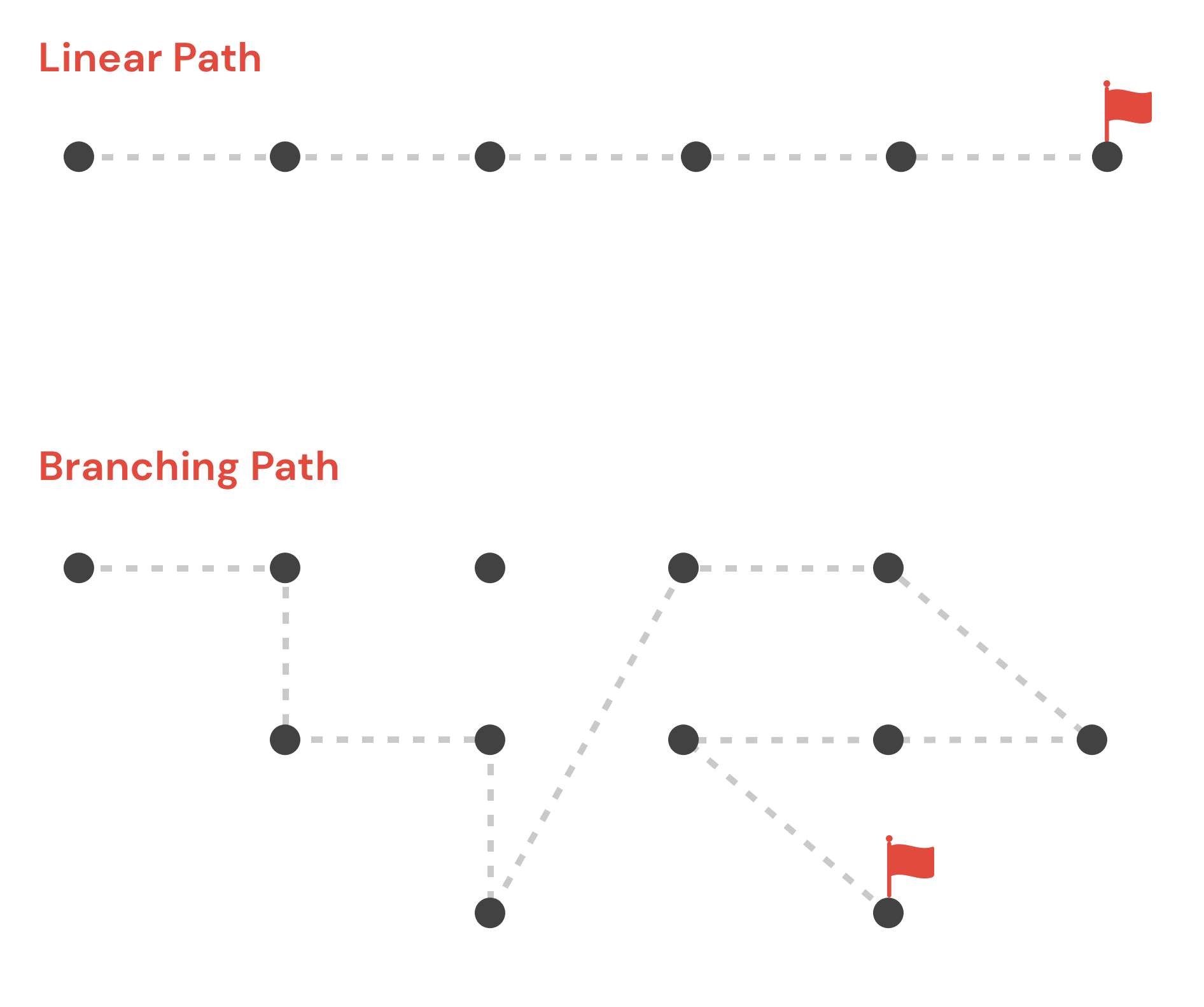
Complexity and unpredictability are the hallmarks of branching user flows. It's a welcome change to be allowed to explore literally hundreds of different paths of discovery.
In recent years, UX designers have begun to view user experience as task-based rather than personality-based. Many UX experts advocate for a Jobs to Be Done (JTBD) framework rather than relying on stereotyped user personas.
We, as humans, have a limited amount of time on this planet. Because of these restrictions, we can only use a small number of products to complete complicated tasks. The story's beginning, middle, and end are all clearly defined and delineated once the task is completed.
Data visualization products can be developed more effectively with the help of JTBD. People turn to data in order to complete tasks and achieve goals that were previously beyond their reach. In contrast, data comes with its own set of challenges. It is not uncommon for us to be faced with more questions than tasks.
Users of data visualization software have a predetermined set of questions they want answered. If you're looking at data, you're doing so because you have a specific goal in mind. Our job is to anticipate these kinds of questions, so we create datasets that make it easy for users to find the information they need.
It's not always clear what the questions are at first. To prepare for workshops, it's helpful to use tried-and-true UX methods like user interviews and empathy mapping. It is possible to describe the role, desire, and motivation of a user through the use of user stories.
Telling stories about the people who use data can get the ball rolling on discussions about its potential applications. In addition, it illuminates the motivations behind the pursuit of specific insights. What can we do with these tales now? Each of them can be asked a question (or multiple questions). In order to address these concerns and questions, we begin by creating a list of features for our data-driven site.
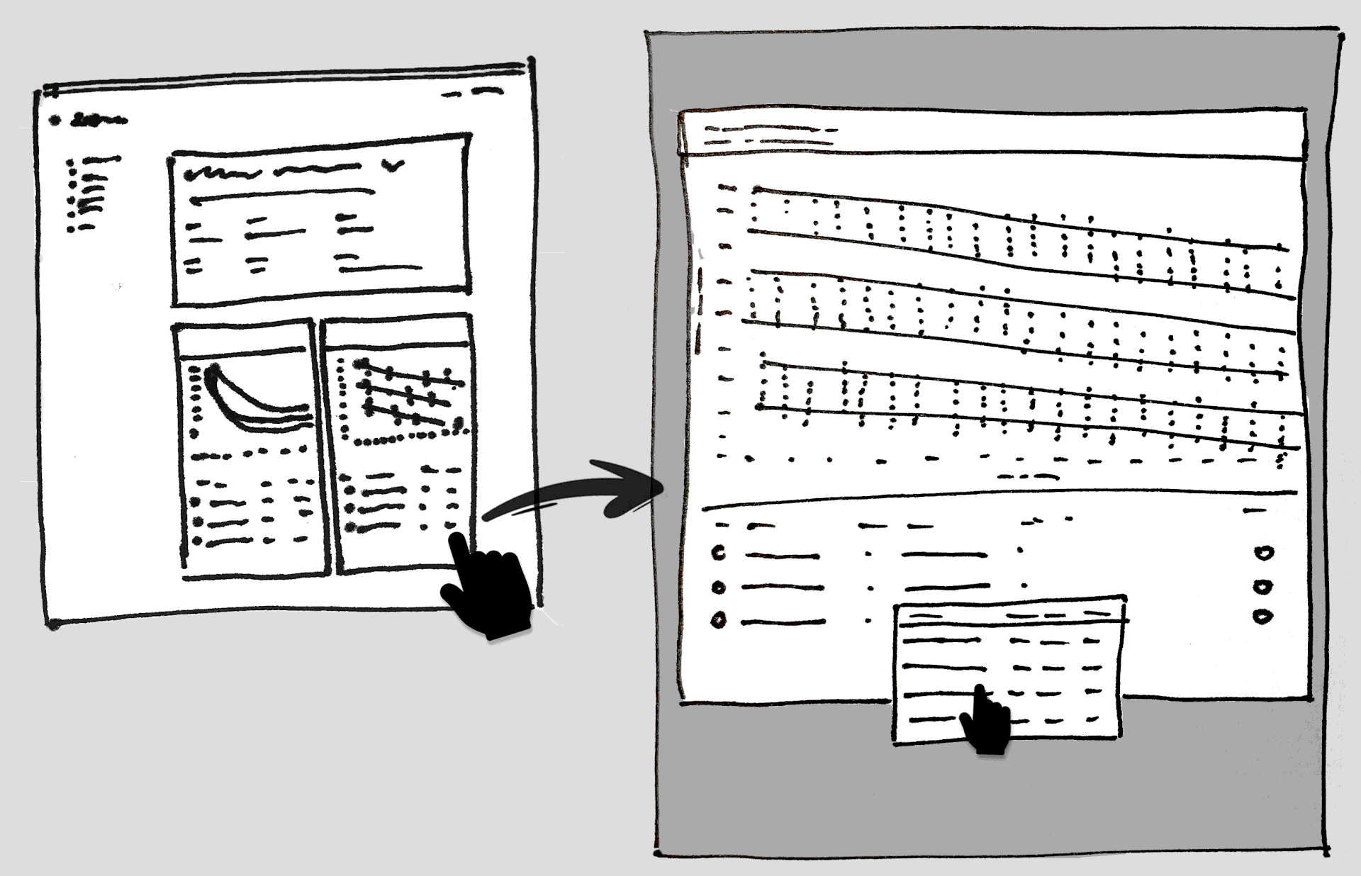
The design process typically begins with a list of features! Rough sketches, wireframes, and mockups are then created in attempts to get it right the first time.
This initial "discovery" phase is critical for the best data visualization product. The first step in creating a solution is to figure out what we're building and what questions we need to answer.
Your first questions as you begin to develop data visualization should be about the value it provides to your consumers in relation to their objectives, as well as how best to display it, and how to ensure that your data is high-quality.
Ask yourself who is the data and information being created for? Many users may have mental models that are pre-established within the context of the material that should be leveraged in order to create more intuitive experiences.
Additional questions that may be beneficial:
• What particular benefit does this visualization provide?
• What type of exploration might a user choose to explore in?
• What is the efficient and effective method to convey the key data?
• Which data points are most crucial?
• What mental models and terminology may divide data into subsets?
• Is it to be interactive, dynamic or simply present relevant information?
• How can it be tested?
In conclusion:
I this brief article we looked at some questions to ask to begin a new process towards creating better user experiences using data visualizations. The second part of the series will address many technical aspects to take into account, along with some other questions to ask, when creating a user experience focused around data visualization and analytical exploration of information.
Big Data and UI Integration
As early as 2006, Clive Humby, a renowned British mathematician and marketing genius, declared, "Data is the new oil." Business intelligence (BI) and data visualization are still ever-growing concerns. Data went from being scarce, expensive, and difficult to collect and process to being abundant, inexpensive, and incredibly difficult to analyze. This is when the idea of big data emerged. Huge amounts of information were so vast that they were difficult to capture, store, understand, and analyze using traditional software. However, this information is useless if individuals can't understand it. A gigabyte of data housed in a data center is a nuisance, but if properly handled, it may be transformed into digital gold. Today, effective data visualization is an important part of BI and is important for making a user-friendly business dashboard.
Big data is frequently coupled with algorithms to develop predictive analytics for various analytics processes that continue to highlight the value of the data. If you do not have a PhD in data science, the raw data might be difficult to comprehend. This is where data visualization comes in. It allows us to change the way we perceive the data in order to gain a more vertical understanding of the information presented and identify new patterns and trends. Data visualization truly empowers users of almost any kind because it gives them specific and actionable perspectives.
Modeling of Graph Data
Data modeling is the process of turning your ideas about your data into a logical model that can be used to make sense of it. During the graph data modeling process, you decide which entities in your dataset should be nodes, which should be links, which should be discarded, etc. The result is a blueprint of your data’s entities, relationships, and properties. You can use that blueprint or schema to create a visualization model for your charts.
Flexible Business Intelligence
The resulting schema allows for flexibility when creating data visualizations. Business intelligence systems come in two types: one is for reporting, and the other is for making analysis fun and easy with interactive, graphical tools. In data storytelling, visualizations are used to tell stories about how analytical conclusions are reached and why they are important to the user. This helps people work together. The more people use self-service visual analytics solutions, the more opportunities they have for uncovering why something is going on. Using this can help people bridge the gap between reporting-focused enterprise BI systems and more advanced analytics systems. The tools can make changes as their needs change. Are they getting the right information at the right time, in the right format, to the right person?
Key Areas to Consider when Choosing
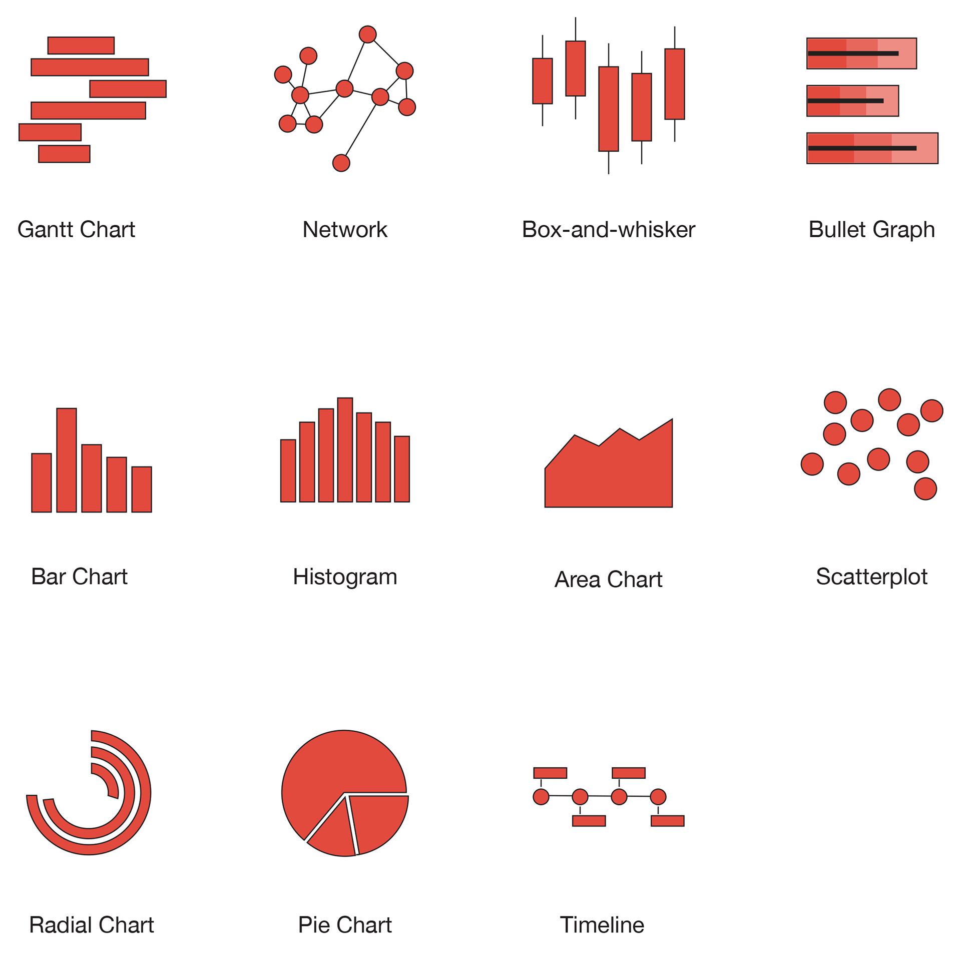
Visualization Types - As mentioned earlier, there are many types of data visualization. Choose which types are needed for the use case in question.
Customization - What kind of style and design features are available? Some situations require very strict control of color and styling to stay in line with the brand's rules.
Rendering Methods - The render method is responsible for drawing the chart on the page. It is the primary method that has to be called after configuring the options.
Easy-to-use - One often overlooked area is the learning curve associated with the library. The ability to add new team members and transfer knowledge are important to think about.
Support and Documentation - In the current era of constantly changing trends in development, documentation is more critical than ever. Without good support, developers are limited in the value they can extract from the data.
Interactivity - Consider if the data needs to be interactive for the user. Some of the libraries are much more robust in their interactive capabilities.
Choosing the Right Visualization Style
With so many available, choosing the best method can be critical. Some kinds of data visualization are uniquely suited to the way our minds operate, and we begin to make meaning of them instantly. For example, while humans are extremely precise and efficient in estimating the length of objects and their location in two-dimensional space, we are less adept at rapidly and accurately estimating angles, area, or color.
For this kind of thing, pie charts aren't very useful. They take integers and encode them as circular slices. This implies that the numerical data is shown in three ways. The angle of the slice, the area and the outside circumference's arc length. It is easier to compare lengths on straight lines than it is on curved lines, especially when they do not begin in the same location. That implies these kinds of charts are less effective for comparing statistics with any degree of accuracy. If you have a few slices of the chart that are all drastically different in size, this is OK, but requires significantly more effort to interpret than a bar chart containing the same data.
In the case of a dashboard, there are likely going to be several of these on the same page. Thus, the cumulative impact is that it is far harder to discern the information. Along with this, because the statistics on a dashboard change rapidly, there will be frequent and minute changes.
Choosing the Right JavaScript Library
JavaScript has a lot of libraries that make it easy to show data, graphs, charts, animations, and even add interactivity. These are a few important reasons that choosing the right library is critical to how we build things and what we will be able to do with them in future development. One particular thing to take into consideration when making your final selection of a JavaScript Data Visualization Library is the ability to customize the content.
Here is a list of the popular JavaScript data visualization libraries.
In conclusion:
There are many solutions for integrating your data into custom and powerful data visualization tools available these days. Choosing the right tool and fully understanding how the users intend to use the tool is critical. These kinds of products have UX processes and technical problems that are unique to the tasks they are meant to help people with.
Throughout this article, we introduced a number of important factors to consider before undertaking a data visualization and analytics product design. These include data modeling, libraries, requirements and more. I hope that in your next project you will be able to ask the right questions and use your user-centered tools to help individuals learn.