Roles
UX/UI Design
User Research
Visual Design
Strategy
Overview
Consulting for Assurant, a company offering products and services for managing risks worldwide. Its businesses offer a wide range of specialty insurance products for niche markets in property, casualty, extended device protection, and pre-need insurance.
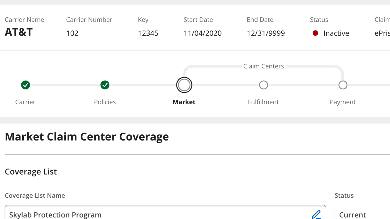
This would be a short sprint for one of the company’s premier software offerings, ePrism. The ePrism Configuration Manager is an organizational tool that allows users to sort through and filter data with factors like date, price, and category.
The Problem
The problem being reported was that users felt there were too many colors being used and it was confusing. The colors were not helping the users improve their understanding of the information being presented and edited clearly.
User Statement 1
As a user in the Market Claim Center Coverage step, I need to be able to easily comprehend the row highlights and messaging,in order to ease confusion and prevent mistakes.
User Statement 2
As a Configuration Manager user, I would like to see the changes highlighted in the rule list items, settings, and hierarchy, so that it is noticeable before saving, especially, when there are multiple changes.
The Current Design
The design includes numerous color indicators for notifications. Although they are intended to help users notice changes, errors, and icons better, the excessive use of colors has adversely led to confusion and mistakes.
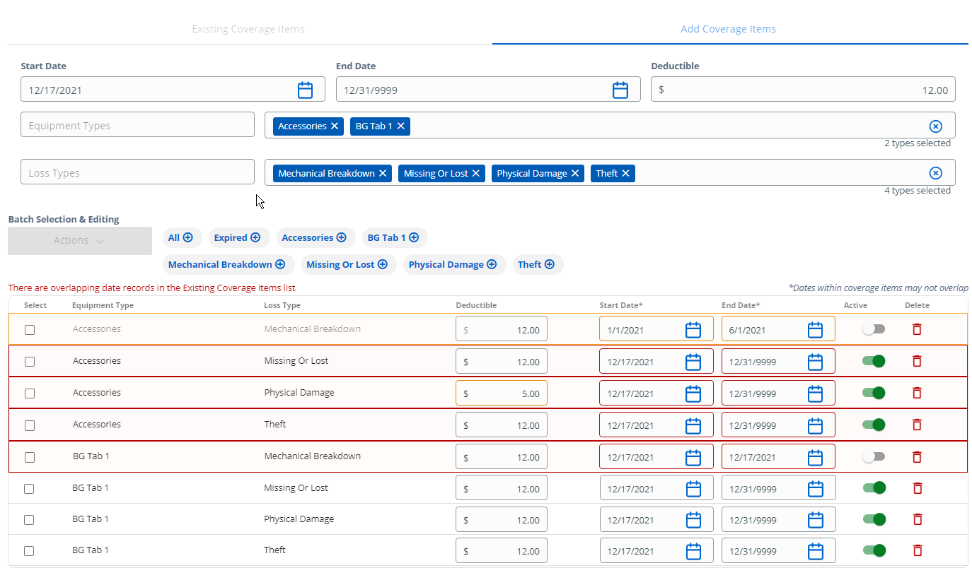
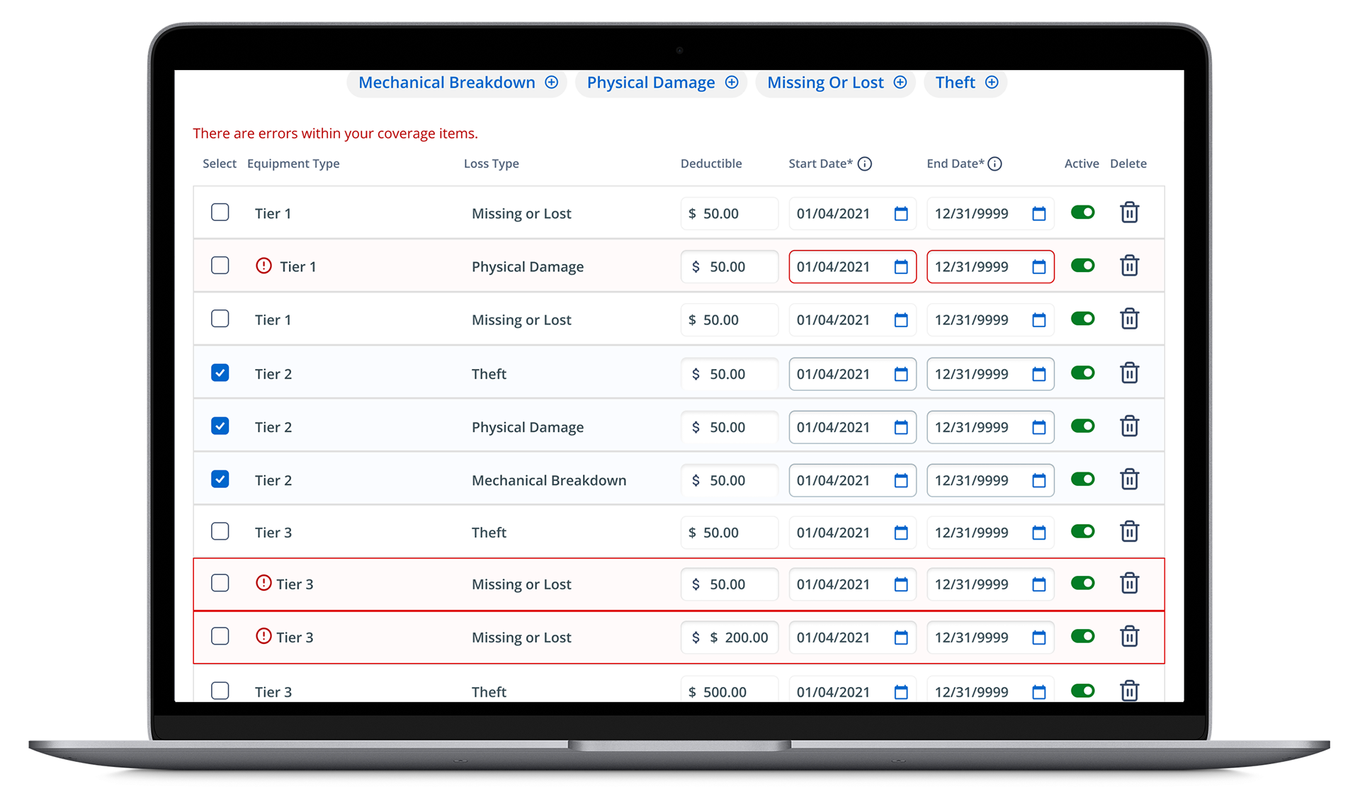
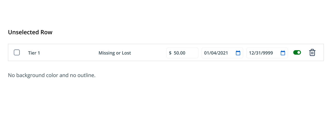
The example below represents an entire row in the table and the smaller input boxes within may be highlighted in red to indicate an error. Additionally, every row contains a delete/trash icon in the same red as the border highlight, which becomes very busy for the eyes when multiple rows contain errors.
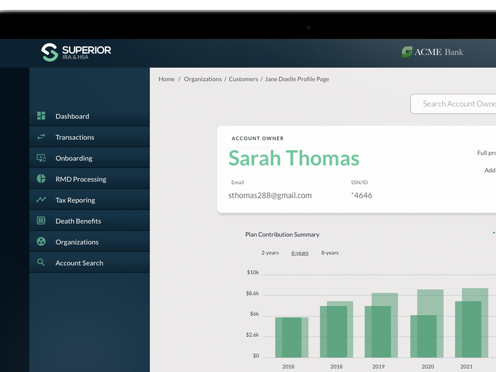
Current application interface is shown.
An entire row in the table and the smaller input boxes within may be highlighted in red to indicate an error. Additionally, every row contains a delete/trash icon in the same red as the border highlight, which becomes very busy for the eyes when multiple rows contain errors.
Exploring the Problem Further
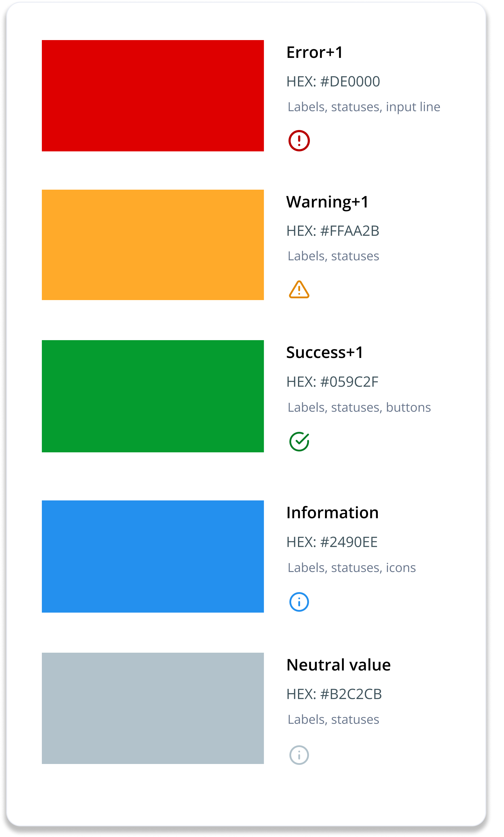
One of the issues with the current design is the overuse of colors. The colors used should be based on a hierarchy system of high, medium, or low-attention items to address this. Higher-attention items are red or yellow to indicate some form of immediate attention or feedback to the user. Low-attention items are colored blue or grey to remain neutral and allow the higher-attention items to stand out.

High-attention
• Alerts (immediate attention required)
• Errors (immediate action required)
• Exceptions (system anomalies, some failure)
• Confirmations (potentially destructive actions)
Medium-attention
• Warnings (no immediate action required)
• Acknowledgments (feedback on user actions)
• Success messages
Low-attention
• Informational messages (passive notifications)
• Badges (signifying new since last interaction)
• Status indicators (system feedback)
Contrast Ratio Concerns
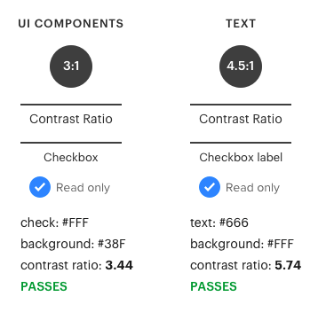
Using a contrast checker, we can verify the chosen colors' accessibility for the interface. Text contrast depends on factors like font size and weight, with a recommended ratio of 4.5:1 for text and interface components. Text requires higher contrast due to reading needs, while interface components have a lower standard since they don't involve reading source code.
Using a contrast checker, we can verify the chosen colors' accessibility for the interface. Text contrast depends on factors like font size and weight, with a recommended ratio of 4.5:1 for text and interface components. Text requires higher contrast due to reading needs, while interface components have a lower standard since they don't involve reading source code.
Exploring Solutions
All of the error types that are sent should result in the background color being highlighted in red. The text will be also changed to read within the rows containing the error. A red alert icon will also be presented along with the error message displayed.
First Iteration Styling Error Notifications
The notification hierarchy stack begins with the error notifications. As a result, they merit using different strategies for attracting attention to themselves. I began by highlighting the border and text color to red while placing the warning icon and messaging directly under the input containing the error.

Input Error
Red background and border on the row, red outline in start and end date, Equipment Type and Loss Type (ET & LT) with red color font, red error icon and message display inline, inputs are enabled even if in an inactive state.

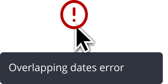
Overlapping Dates Error
Red background and border on the row, red outline start and end date, ET & LT with red color font, red error message at the top of the grid, and red "error" icon, and message display inline per duplicate row and inputs are enabled even if in an inactive state.
User and Client Feedback
Users felt the information was much easier to understand and locate through this iteration than in the original designs. However, when several rows are displayed simultaneously, the vertical expansion causes the information to become over-extended across the interface.
Final Concept Styling Error Notifications
In the final iteration, the notification hierarchy stack still begins with the error notification, highlighting the border and text color to red while placing the warning icon and messaging directly next to the equipment type label.
The warning icon is now in one consistent place on all rows, regardless of the cause of the problem. Tooltips are displayed to provide the user with a clear message as to the nature of the problem when the user hovers over the error icon.

Input Error
Red background and border on the row, red outline in start and end date, Equipment Type and Loss Type (ET & LT) with red color font, red error icon and message display inline, inputs are enabled even if in an inactive state.


Overlapping Dates Error
Red background color tint on the row, red border around the date fields, and the red error icon and message display directly below. Inputs are enabled even if in an inactive state.
Alerts and errors shown in a full-length table.
Complete User Scenarios - Table Rows
Next Steps
Once the designs are implemented, we can gather feedback from ePrism users to see if the user stories were successfully executed. That is,
Can ePrism users easily comprehend the row highlights and messaging in order to ease confusion and make fewer mistakes?
and
Can users identify the changes highlighted in the rule list items, settings, and hierarchy before saving, especially, when there are multiple changes?
Gotta project?
Have questions?


