Roles
Research
Wireframing
Visual Design
CMS Design
Overview
Redesign the website of Improving, a modern digital services company offering global IT consulting, software development, and agile training.
The site design incorporated a content management system (CMS) that marketing could use to implement frequent site updates.
The Problem
Improving wanted to update its website, giving its online presence a fresh look. Their website development team wanted to create a modern and engaging website as part of their rebranding efforts. However, the existing site made it difficult for the marketing team to make simple changes quickly without help from developers.
Market Opportunities
The goal was to empower the marketing team by implementing a content management system (CMS) that would allow them to edit and update the site on their own with ease. By simplifying the editing process and reducing reliance on developers for small changes, the project aimed to improve efficiency and keep the website up to date.
The Solution
Improving embarked on a website update and successfully transformed their online presence into a captivating and contemporary platform. With its rebranding efforts fully realized, the new website reflects its refreshed brand identity. The marketing team, once burdened by time-consuming processes, now enjoys the freedom to swiftly make edits and updates without relying on developers.

Built for Responsive Design
The site was designed to be fully adaptable for mobile. There were different considerations taken for mobile vs. desktop display. One of the issues discovered after some user testing was that the users would tend to miss content if they moved too fast down the page. As a result, many of the CSS animations were eliminated for mobile.
Before we get into more details, it is important to understand how the design reached this point.
Competitive Analysis
A competitive analysis of similar web properties was done to gain insight into visual language, sales, and marketing tactics. A couple of websites that the team was fond of were Bentobox and Envoy.
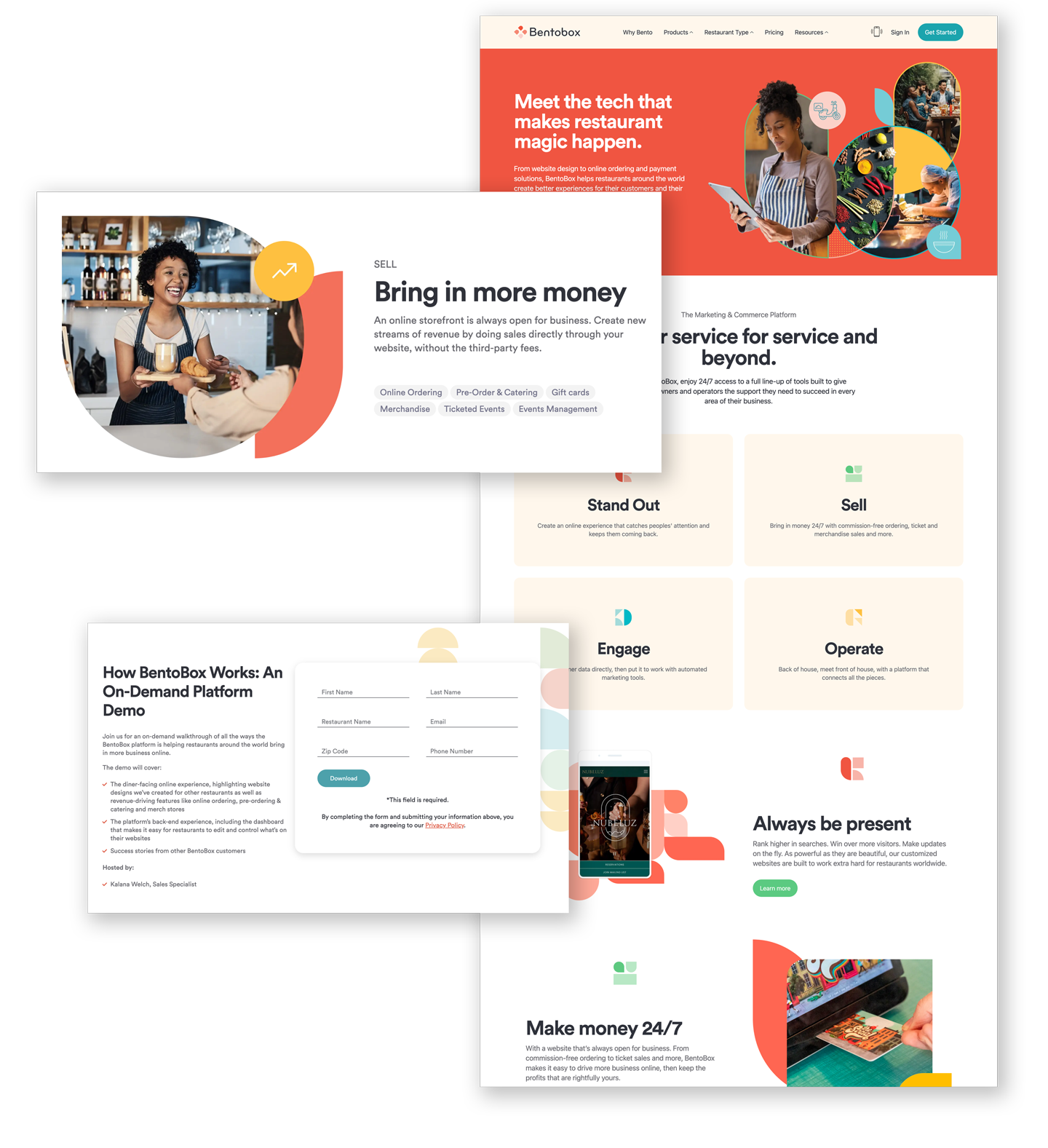
Bentobox.com
One significant inspiration for our team in establishing the look and feel of our new branding efforts into a website was the website Bentobox.com.
The soft pastel colors, soft rounding of corners, gracious amounts of white space, and graphic illustrations combine for a fun and inspiring web experience.
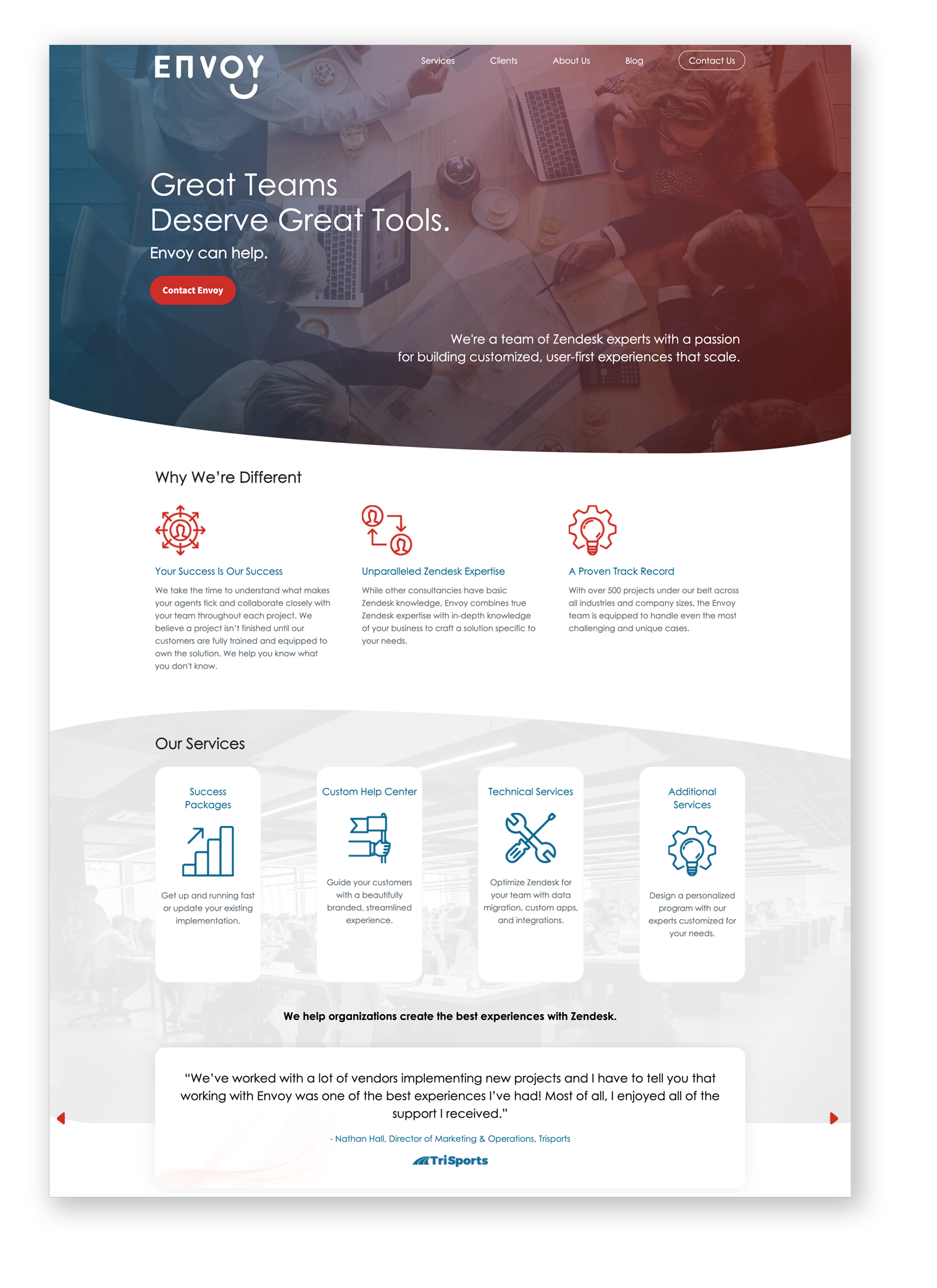
Envoy
Another source of inspiration for our team in establishing the look and feel of our new branding efforts into a website was the website for Envoy.
The gradient colors, soft rounding of corners, gracious amounts of negative space, and bold iconography come together for a fun and inspiring web experience.
Users & Audience
The core audience is made up of two main segments. First, prospective customers looking for a trusted IT partner. Second, potential hire candidates looking for a fulfilling job opportunity with a commitment to being a great place to work and allowing for career growth.
Personas
A few different persona types were crafted to encompass various individuals, including students, executives, IT professionals, and potential job prospects. Below is a sample of one of the prospective candidate personas created.
“I want to be part of a community
where every member is appreciated
and recognized for fostering a real
feeling of open collaboration.”
where every member is appreciated
and recognized for fostering a real
feeling of open collaboration.”
Bio
Steve is a full-time developer community manager for an open-source tech startup in SF. He spends most of his time thinking about facilitating a better contributor experience for his startup's product while continuously talking to new and potential contributors for insights.
Steve is a full-time developer community manager for an open-source tech startup in SF. He spends most of his time thinking about facilitating a better contributor experience for his startup's product while continuously talking to new and potential contributors for insights.
Goals & Interests
• Optimizing his startup’s contributor experience.
• Finding ways to automate insights to focus on solutions.
• Aligning opportunities with my strengths.
• Engage with new contributors to the tech community.
• Optimizing his startup’s contributor experience.
• Finding ways to automate insights to focus on solutions.
• Aligning opportunities with my strengths.
• Engage with new contributors to the tech community.

User Research
User research comes in all shapes and sizes. For this project, user journey maps, card-sorting studies, and user interviews were applied to get us started.
This journey map highlights her progression from initial curiosity and exploration to a committed decision to enroll in an in-person Scrum training course, capturing the emotional and cognitive journey she undergoes as she becomes more aware of the value of Scrum and takes steps to enhance her skills and knowledge.
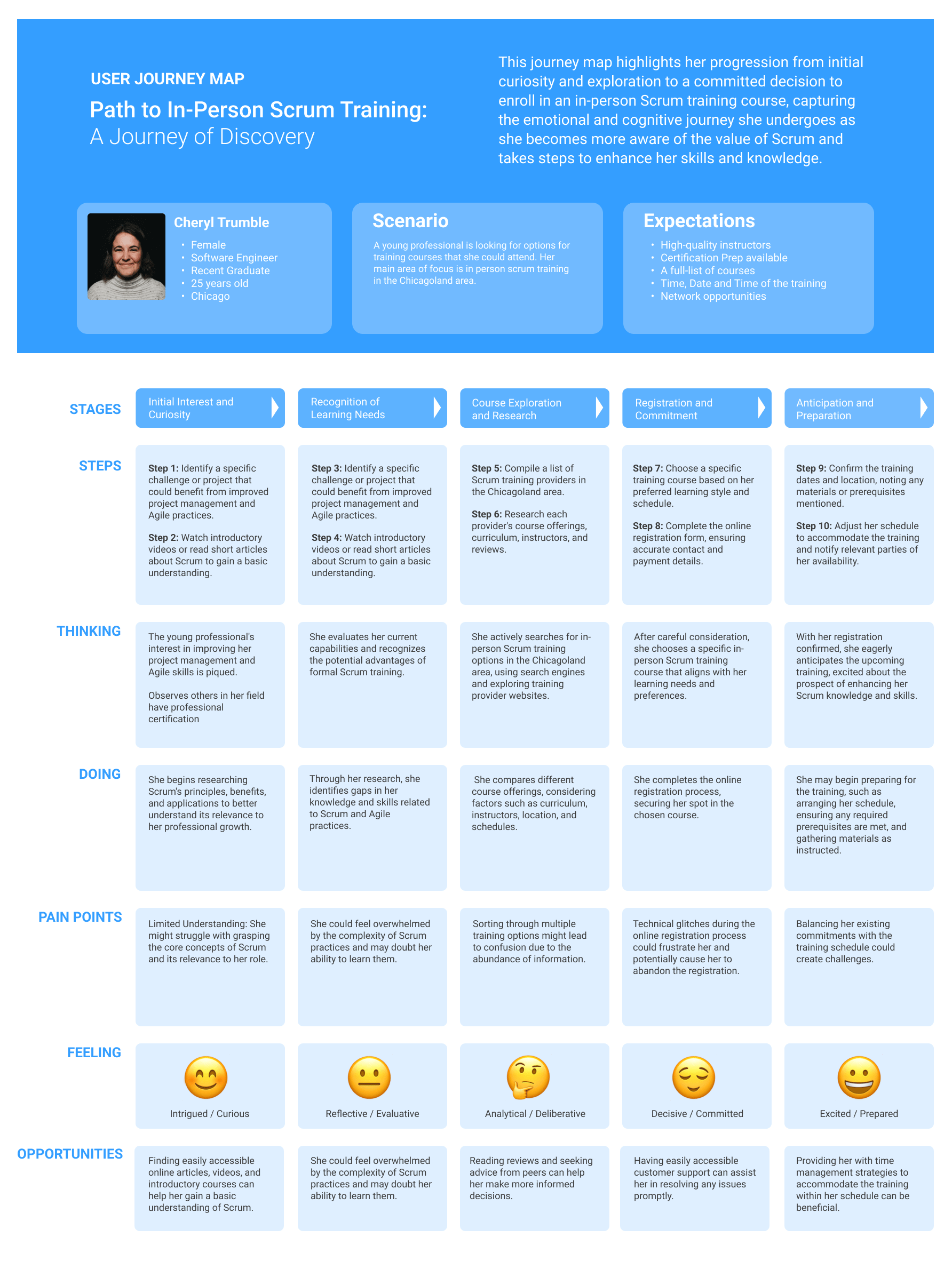
This journey map highlights the user's progression from initial curiosity and exploration to a committed decision to enroll in an in-person Scrum training course.
Card Sort Study
A card sort study was implemented to gather insights regarding our website's top-level navigation while simplifying the user experience. During this process, I asked participants to organize navigation components into relevant groupings, which helped understand their mental models and preferences when navigating the site.
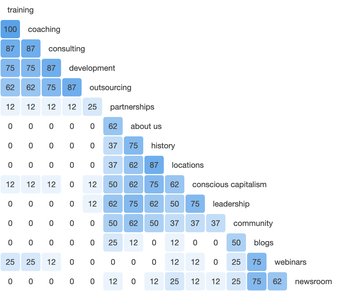
A similarity matrix of the card study results.
The results allowed the team to find patterns and identify potential improvements for our top navigation, ensuring that it matches more effectively with users' expectations and streamlines their interactions, ultimately leading to a more intuitive and user-friendly website.
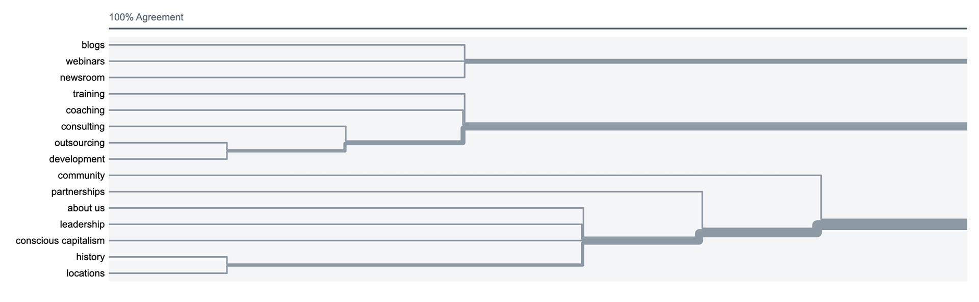
A dendrogram visualization compiled of the actual agreement of participants within the card study results.
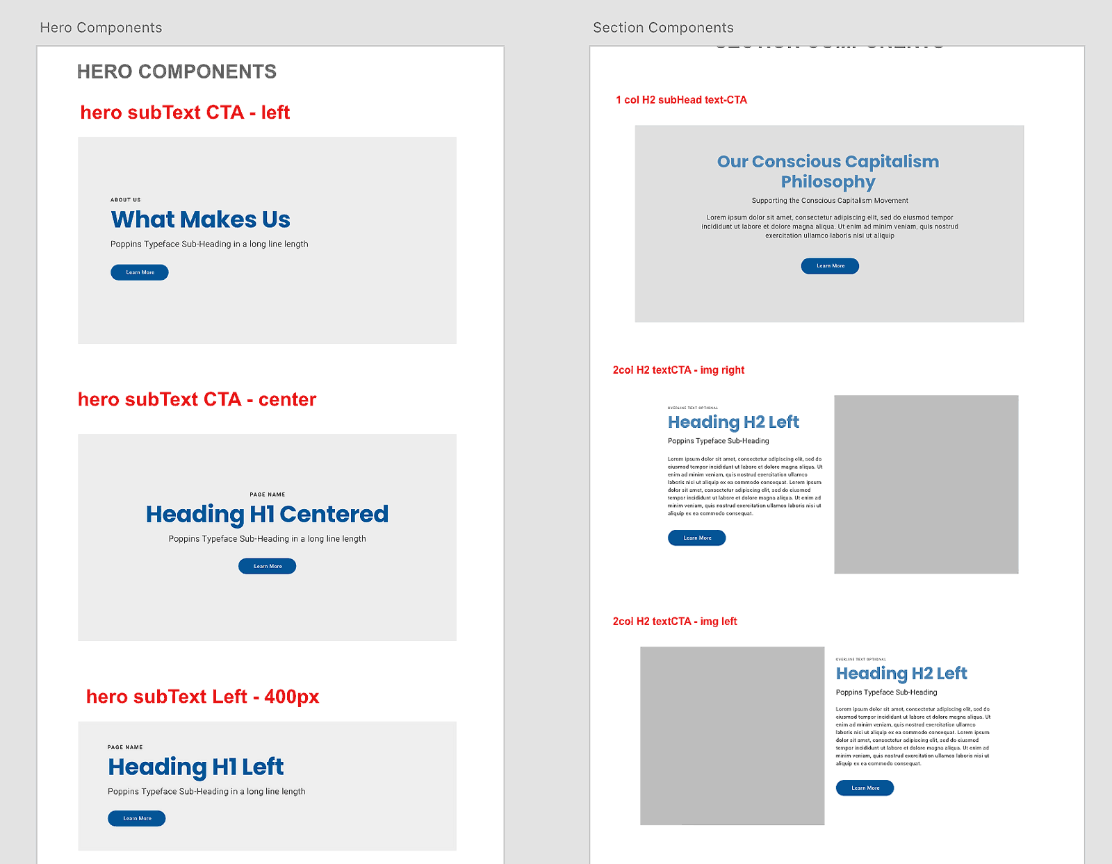
Information Architecture
The team used some very simple wireframe drawings in order to provide a clear visual understanding of page structure, layout, information architecture, user flow, functionality, and intended behaviors.
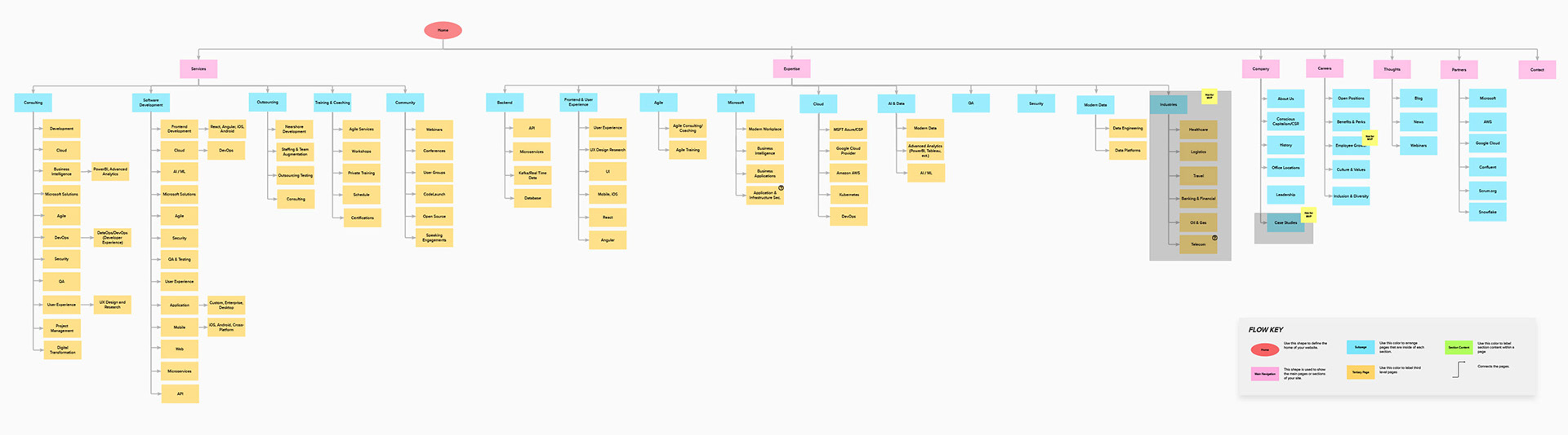
Wireframe Drawings for Layout
The team used some very simple wireframe drawings in order to provide a clear visual understanding of page structure, layout, information architecture, user flow, functionality, and intended behaviors.
Design Style Guide
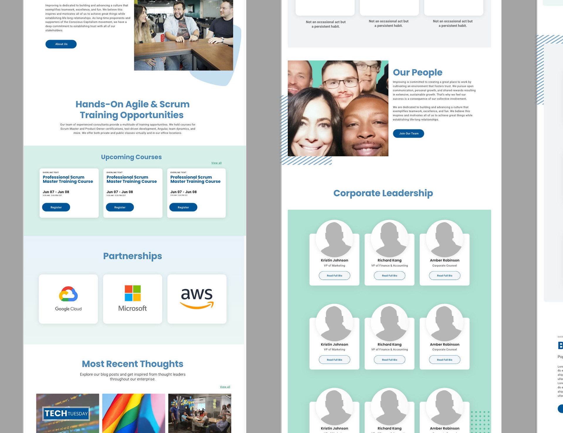
The new brand material for grammar, tone, logo usage, colors, visuals, word usage, point of view, and more was combined into a visual design system.
A clear brand style guide ensures the website is consistent, polished, identifiable, relevant, and engaging. Vibrant hues and playful pastels were strategically used to create a captivating digital space.
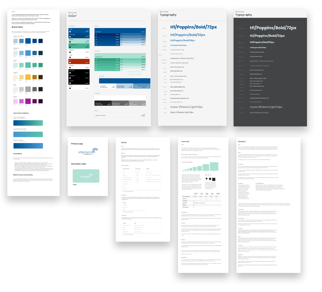
Imaginative illustrations and vibrant photographs were integrated to create an immersive experience that fostered an atmosphere of curiosity and discovery. These visuals brought the content to life, sparking a sense of fun and learning into the website.
Introducing a bit of "Flair"
One special feature, given the moniker "Flair," was implemented to add a custom feel to elements on the site. This feature allows for flexibility by placing Flair on any corner of the image using the Content Management System.
Flair: noun; a uniquely
attractive quality.
attractive quality.
The team chose eight elements, providing various options to enhance and customize the visual experience. The number was limited to maintain consistency and familiarity across various components in the CMS.
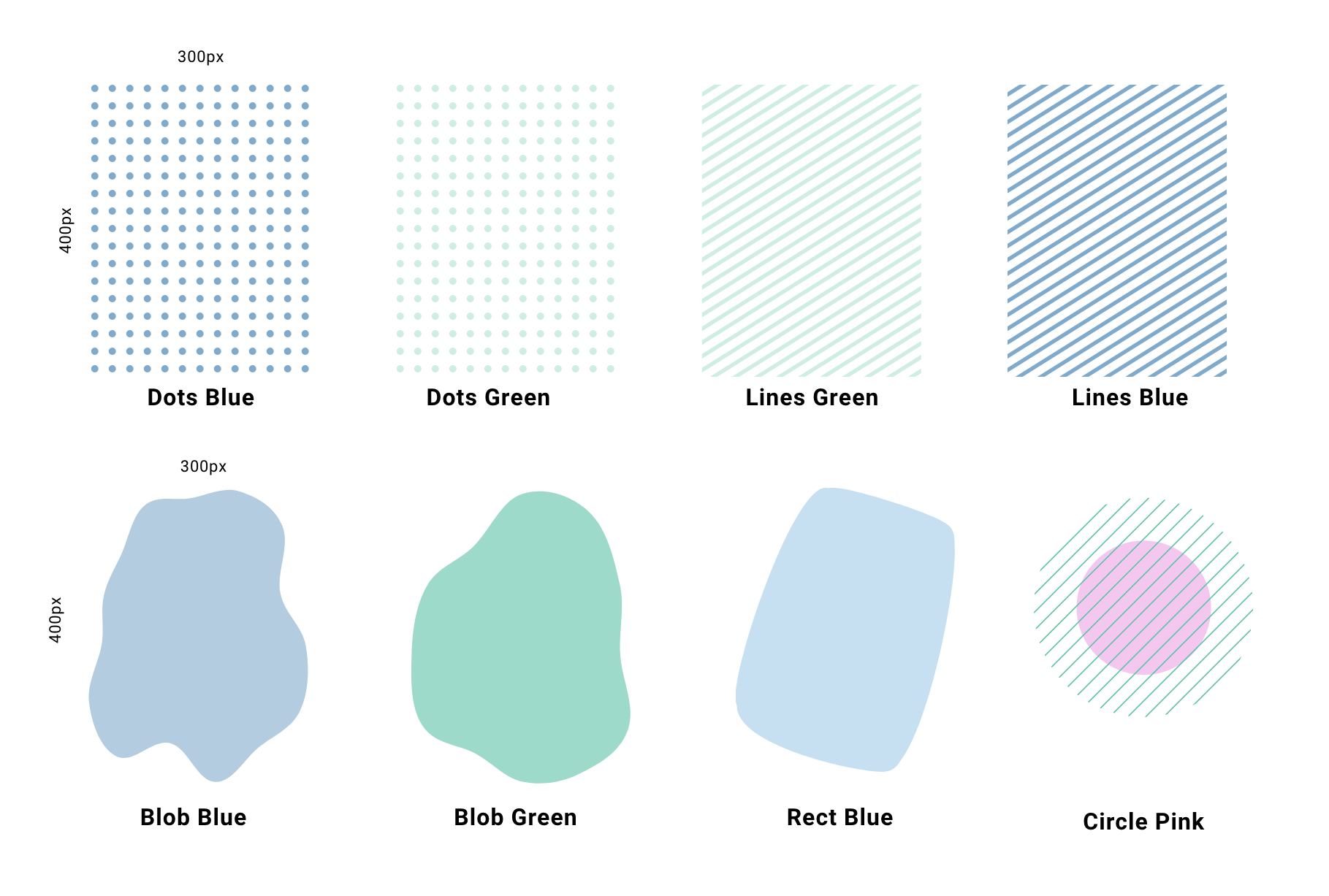
The eight selected "Flair" elements with variable names given
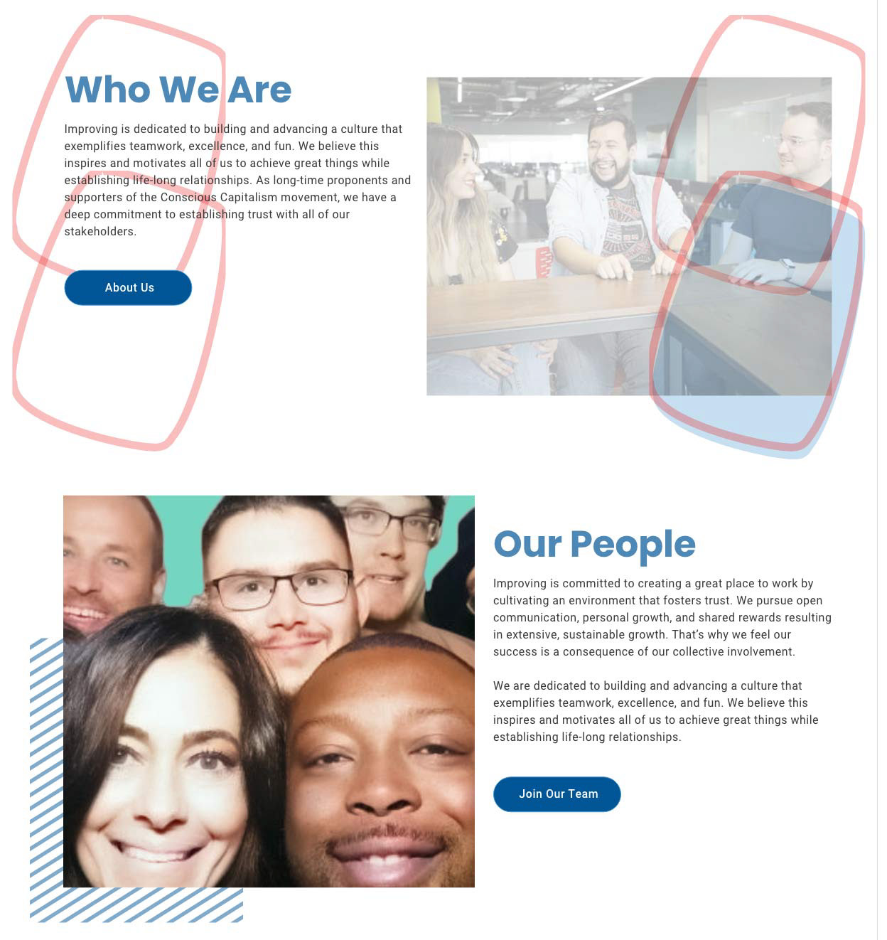
The illustration shows the possible placement of the "Flair" if the user chose the element labeled "Rect Blue" in the CMS. This feature allows for flexibility in marketing by allowing the placement of "Flair" on any corner of the component.
The second example in the illustration displays the "Lines Blue" element placed in the bottom-left position of the component.
Bringing it to Life Through Animation
Overall, animations in user experience design improve usability, create a more engaging and enjoyable experience, and assist users in navigating interfaces more effectively.

The Home Page Hero
To add some special interest to the "hero" section of the home page, I created a customized CSS animation to create a slowly morphing blob shape. The shape is made to mask a selected image chosen by marketing. In this case, a phone and world image was used. Other accents slide into place on load and then stay remain static.
To add some special interest to the "hero" section of the home page, I created a customized CSS animation to create a slowly morphing blob shape. The shape is made to mask a selected image chosen by marketing. In this case, a phone and world image was used. Other accents slide into place on load and then stay remain static.
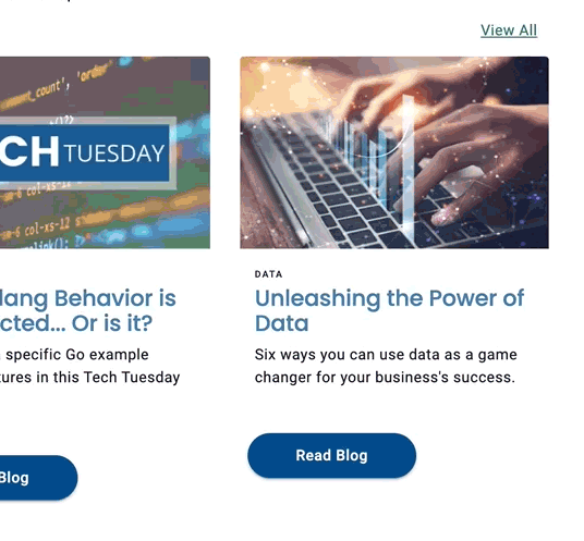
Special Animations on Hover
Another CSS animation used was the hover. When the user hovers over the card object, it scales up about 133% to increase visibility and engagement.
Another CSS animation used was the hover. When the user hovers over the card object, it scales up about 133% to increase visibility and engagement.
High Fidelity Mock-ups
Numerous high-fidelity mock-ups were created to gain stakeholders' approval and alignment with developers. High-fidelity comps of the home, about, and careers pages are shown below as they were created in Adobe XD.
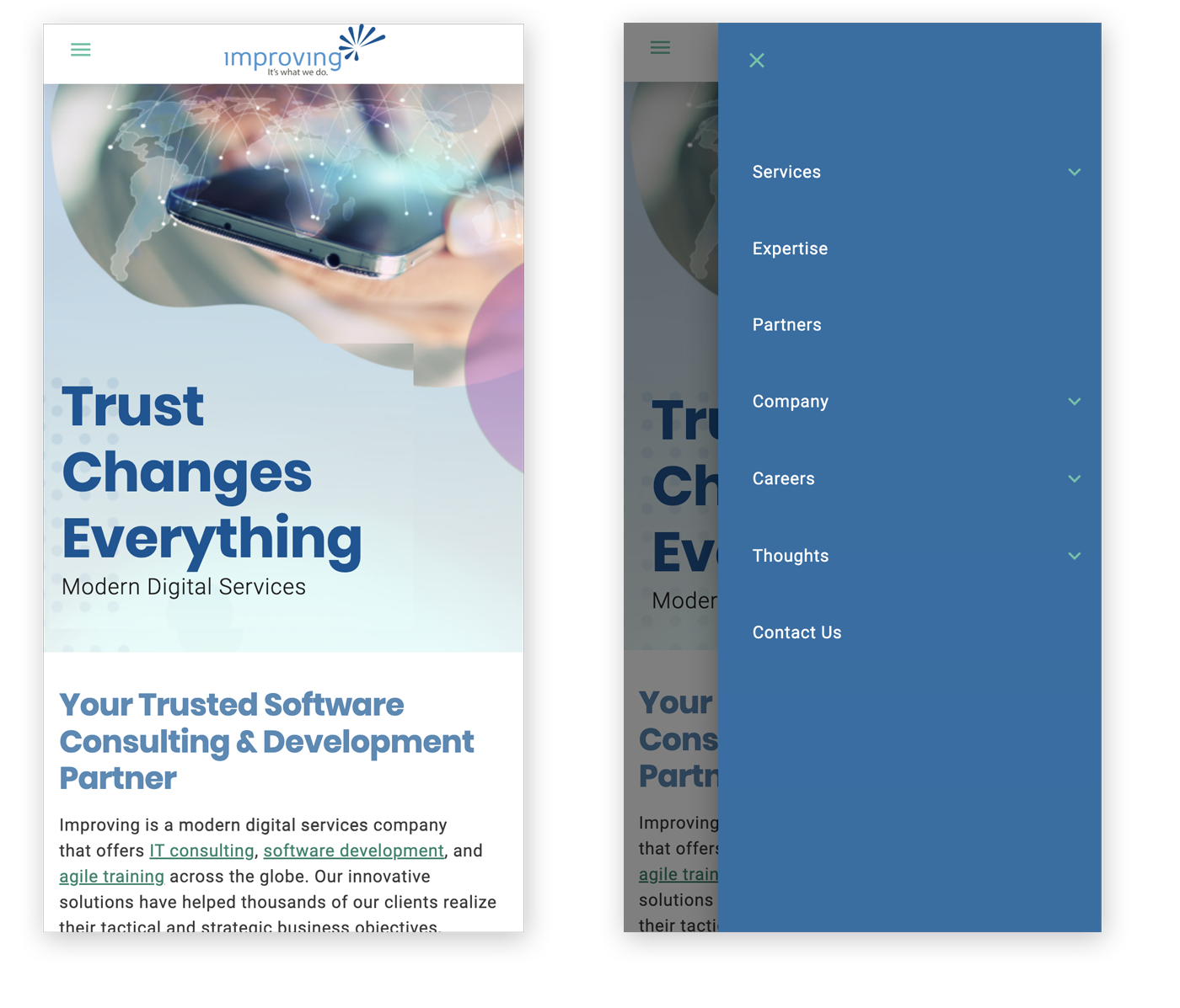
The home page (left) and the home page with the hamburger menu open (right).
Gotta project?
Have questions?