Roles
User Research
UX/UI Design
Visual Design
Prototyping
Strategy
Overview
Superior IRA & HSA was aimed at being the first and only real fintech business in decades to enter the Individual Retirement Arrangement (IRA) and Health Savings Account (HSA) industry. One of their main goals was to use more than a century of experience with IRA and HSA business for banks and credit unions to make the product more user-centric while maximizing efficiency.
The Problem
The results of the interviews showed a great need for a more efficient mode of handling the day-to-day processes of handling IRA and HSA investments. Those interviewed expressed frustration when trying to do simple transactions like transfers, withdrawals, setting up a client's beneficiary, etc.
Market Opportunities
Most banks have almost no standards in place or single source for all the transaction forms in any manner. A form for a new IRA being opened has no relationship or expected similarity to a transfer request, or withdrawal, or any other form. Current methods are inefficient and inconsistent across tasks creating a market opportunity here.

Providing comprehensive IRA services and solutions that can save users time and help to streamline IRA business. The optimized IRA retirement savings solutions and resources give users the leverage to stand out from the competition.
The Discovery Phase
Discovery included a competitive analysis, about the features, functions, and feelings of Superior’s competitors. It was important to look at design patterns that users already use that may be a great place to explore new ideas. Fidelity and Ameritrade were selected as subjects for comparisons.
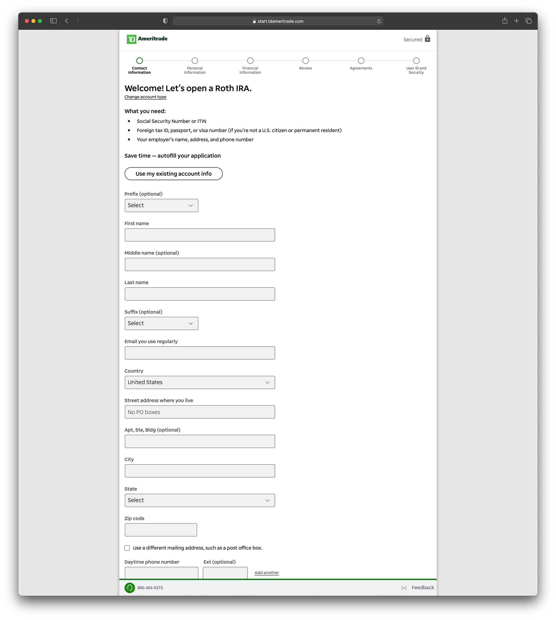
Ameritrade, utilizes a progressive form reveal to split-up the complex task steps to reduce the perceived complexity.
Much like the concept behind bread-crumb navigations, the waypoint markers of the progressive form reveal allows users understand where they are in relation to the rest of the site while offering quick access to higher site levels
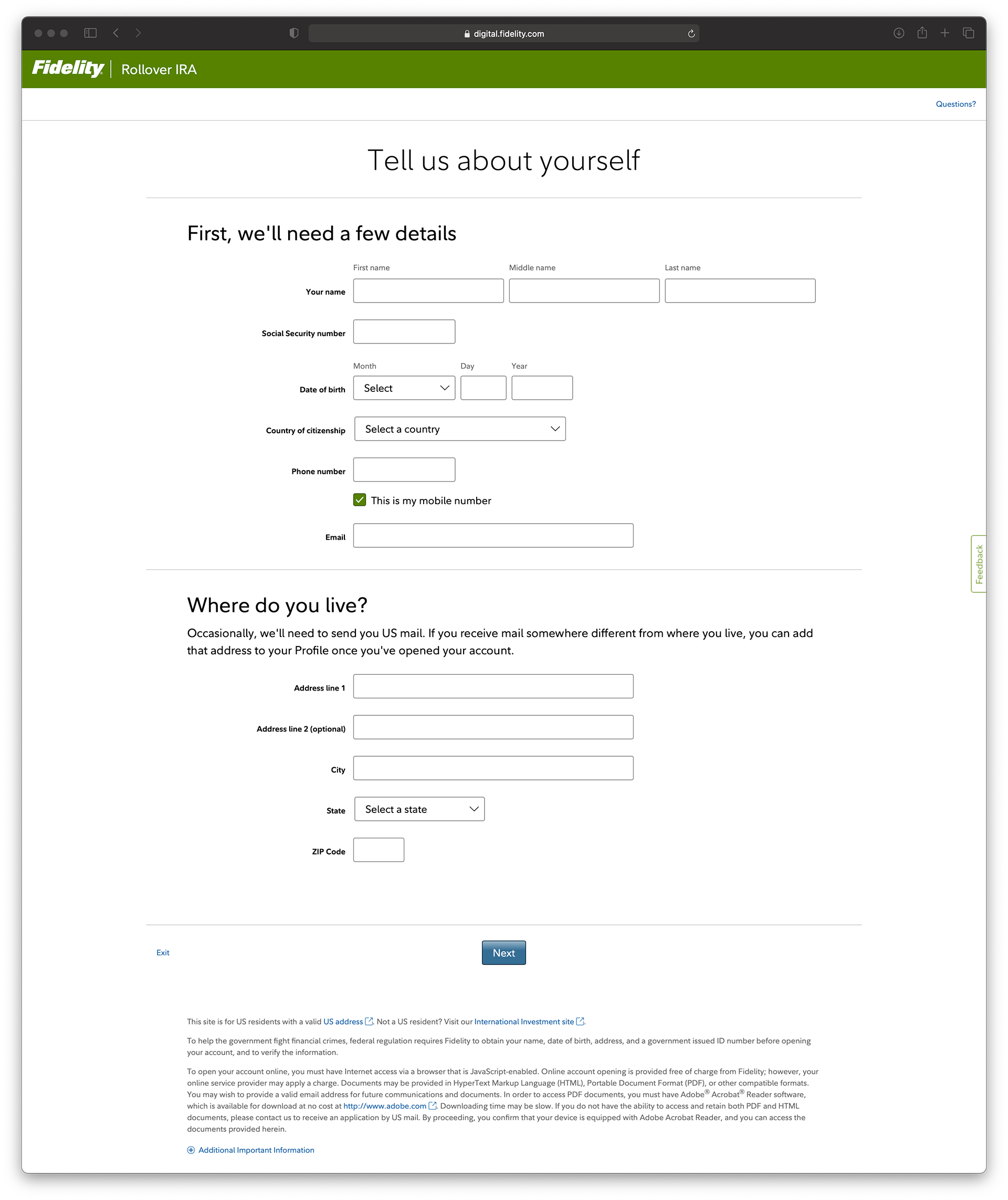
Fidelity, utilizes also uses a progressive form reveal to split-up the complex task steps to reduce the complexity but without the marker points to assist. The margins surrounding the page items are generous and consistent. The alignment of key elements is based on grid layout to also aid in message clarity.
Typeface is used much more effectively on the Fidelity example. A single typeface throughout the site, with generous line-heights (between 133% and 150%) to increase overall legibility and while directing focus to the most important information.
User Interviews
Next, to further understand the needs of our users, a series of exercises were conducted, including user interviews of bank tellers, managers, loan agents and other potential user-types. User interviews were between 30- to 60-minute conversations with a single participant, in which the participants were asked questions to gain a deeper understanding of their attitudes, beliefs, desires and experiences.
Further Defining the Problem
The interviews revealed a great need for a more efficient way of handling the day-to-day IRA and HSA investments. Those interviewed expressed frustration when doing simple transactions like transfers, withdrawals, setting up a client's beneficiary, etc.
One surprising thing that was uncovered was the inconsistent transaction process at bank branches. Most banks have no standards in place nor a single source for all the transaction forms in any manner. A form for opening a new IRA has no relationship or expected similarity to a transfer request, withdrawal, or any other form.
A recurring theme among the subjects interviewed was the importance of a simple and clean layout. Users appreciated the use of white space on using an application that contains a lot of forms. By using adequate space and breaking the stabs into smaller chunks that were easy to identify, they felt like they better understood where they were in the process and easing stress.
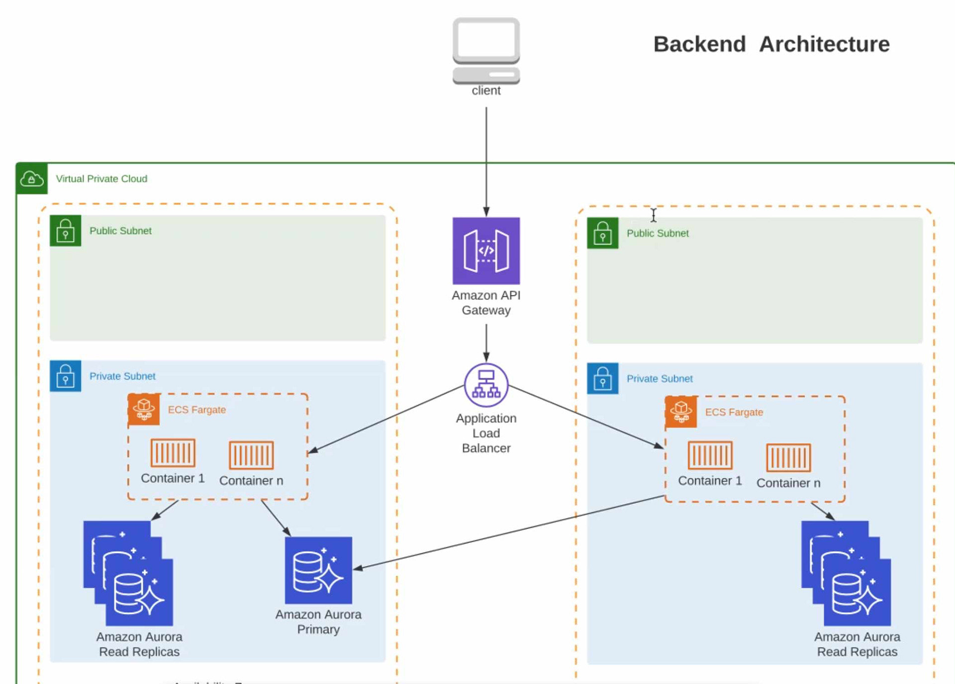
Back-End Architecture
The solutions encompass a full range of capabilities, allowing users to tailor both the features and support to fit individual organization’s needs. This required the team to plan for how the product will support all of the complex services and protocols needed for the highest data security available. During the early stages of the process the back-end dev team laid the foundation for the platform.

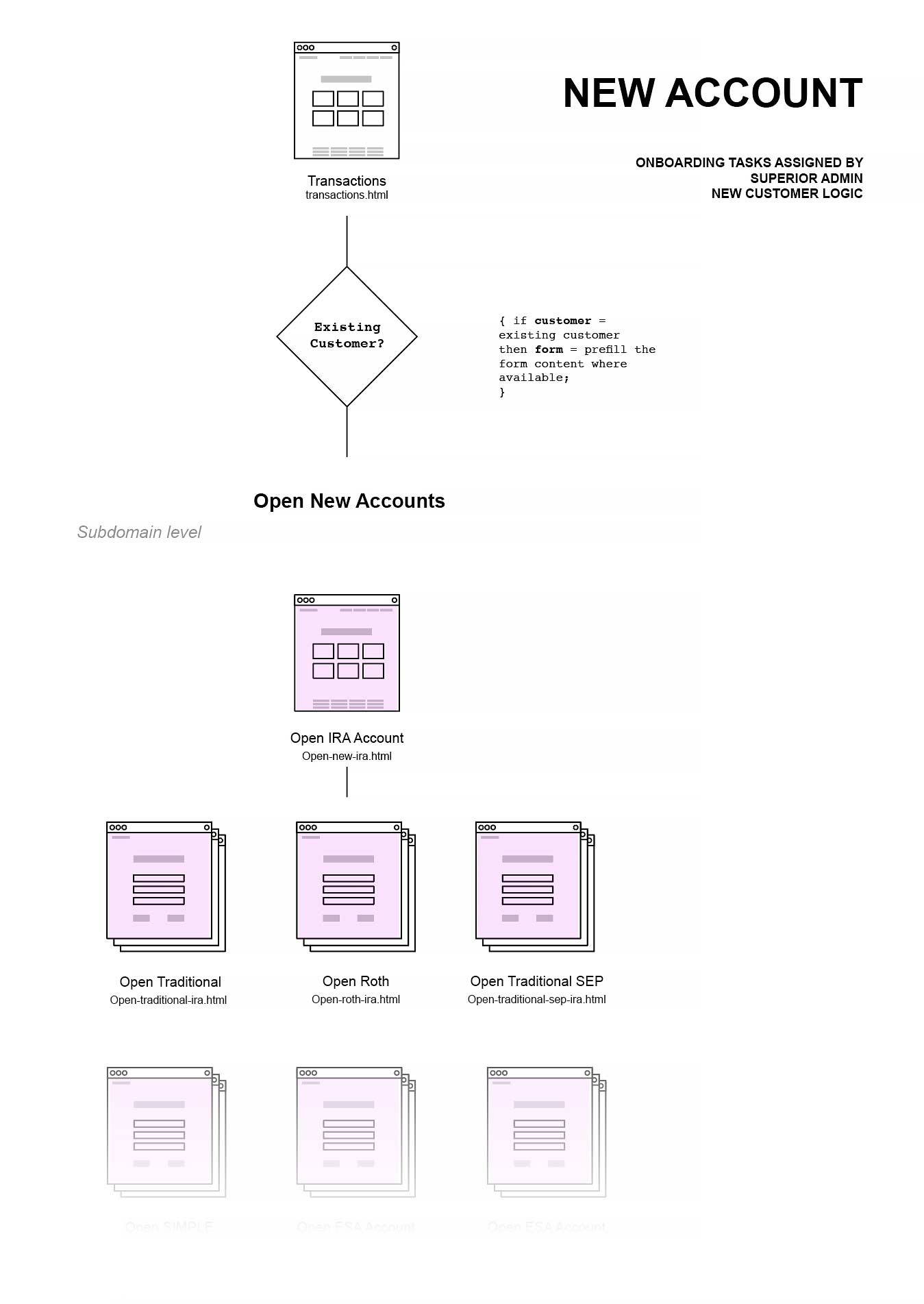
Sitemaps & Information Architecture
For the project to succeed, it would need specific page types that could be used to develop the product with consistency and for scaling up the design. With a simple sitemap, of page types, we decided on the following: Landing Page; Transactions; Monthly Processing; Taxes; and Death Benefits. On the basis of their knowledge of bank procedures and the sorts of content pages they are expected to include, they were selected.

To keep the team focused on the highest priority, transactions, I created user-flows and maps detailing onboarding and the creation of a new account before working starting on the first transactional task.

User-Flows
In the sample user flow, shown below, the user is making a contribution to a Traditional IRA. The first step is to asks "where is the money right now?", in a diamond. Then the user proceeds to follow the prompts to input and select the necessary information.

Transaction Wireframe Drawings
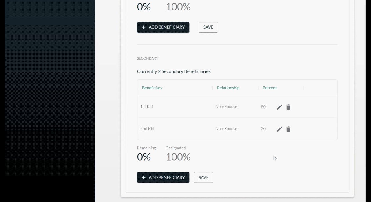
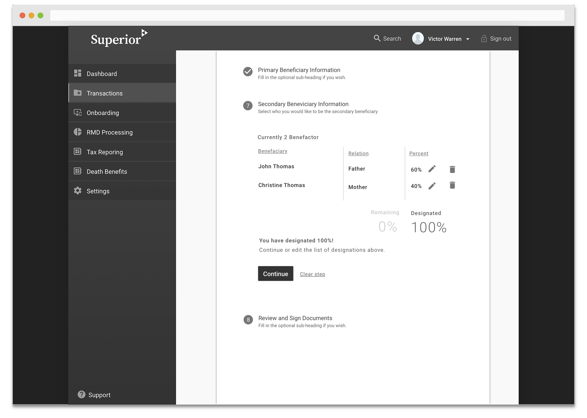
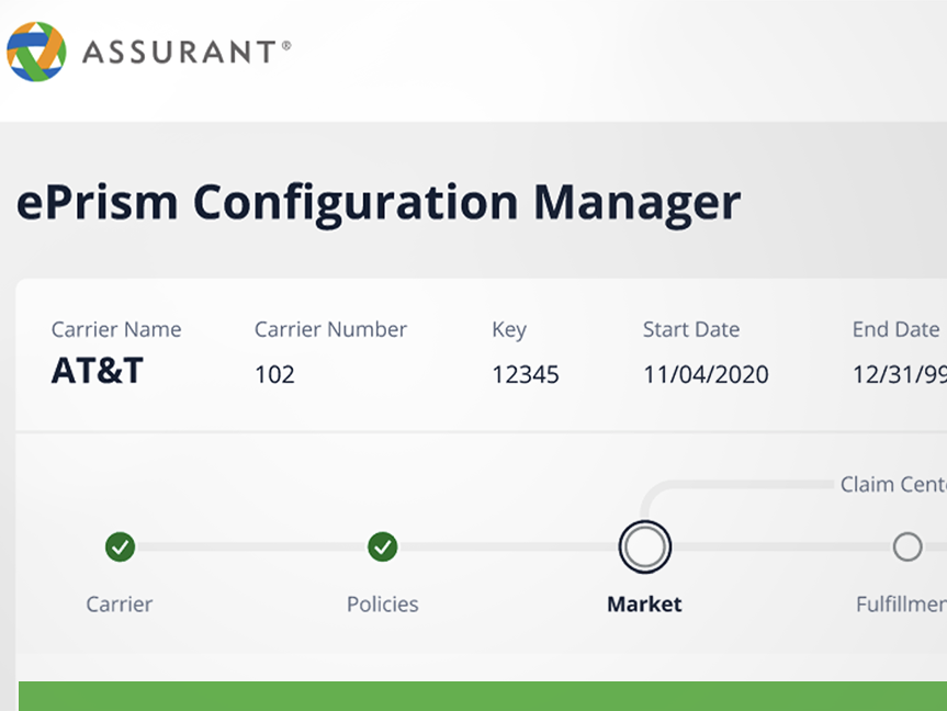
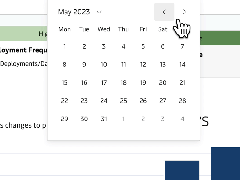
Next, I created clickable wireframe drawings of the transaction forms and detailing the segmented steps into an easy-to-follow system. The navigation was placed first for reasons I spoke of first, however, the vertical stepper was the single most used design pattern throughout the transaction work flows.
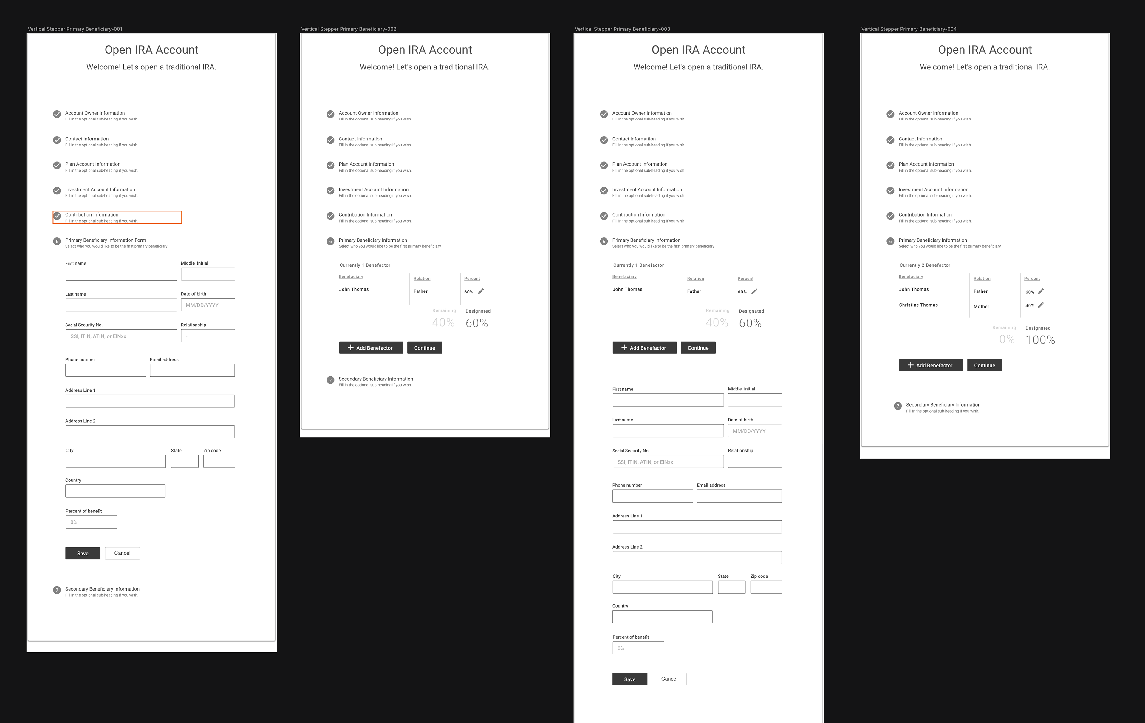
The wireframe drawings created required the most amount of time to complete. Within each step were nested components selected to account for all the transaction steps and interactions needed. Forms were designed from these components to complete each of the transactions. This user-flow would then be finalized with a rendered output of the transaction forms for a physical signature before completing the task.
A vertical stepper design pattern was chosen for the form steps. Here they have clear, explicit numerical identifiers that are placed to the left of each step heading. The numbering system was built to support multiple layers of hierarchy. For example, when a step would have certain sub-steps underneath it the color in the system would reverse and take on a different visual style.
Wireframe showing the vertical stepper workflows
Each of the many banking transaction work flows was developed into a low fidelity prototype. The prototypes allowed us to identify and fix potential problems in the experience, or UX debt, due to creating an easy, or careless solution.
Constructing a Branded Design System
Once wireframes were agreed upon the initial design details were shared with the development team so that they could start creating the front-end framework. I took this time to incorporate brand requirements such as typeface, colors, and logos into a branded design system.
The color system for the design system was based off pre-established brand colors. I then established an adequate number of shade and tint variations to be helpful, while maintaining complete harmony across a wide system as the application grows. Each color was then given a "token" name for easy use in SASS or other CSS preprocessors. The full list of colors along with the naming tokens given to them is shown in the portfolio.

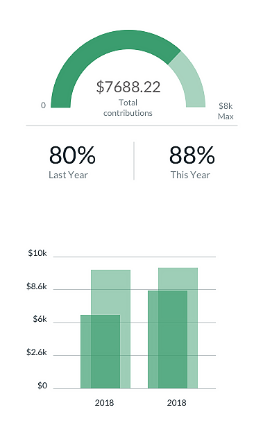
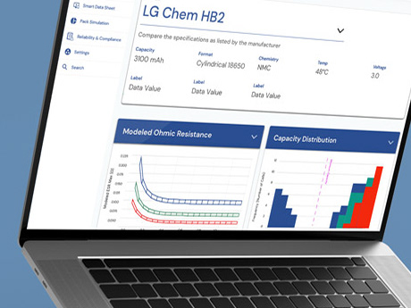
Customized Data Visualizations
Creating a product utilizing data visualizations with the goal of providing insight is fundamentally different from a typical user-centric web experience, although traditional UX process methods can help.
Data visualization components chosen and refined for legibility and clarity by enhancing the most important data in scale and contrast. Each of the modular components were then styled to blend seamlessly into the brand aesthetic using color, type and other attributes.
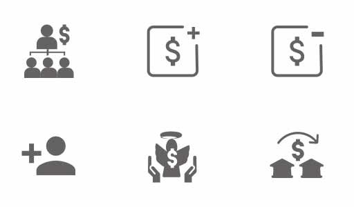
Specialized Icons
The project included the creation of several custom icons to be used in harmony alongside the material design standard icon set.
Documentation and Spacing Details
An implicit 4pt grid was used as the foundation for all sizes, margins, padding, etc. I have found the 4pt grid provides a better experience for our designers and developers, while dramatically speeding things up. This allowed us to create the features faster, without compromising consistency.


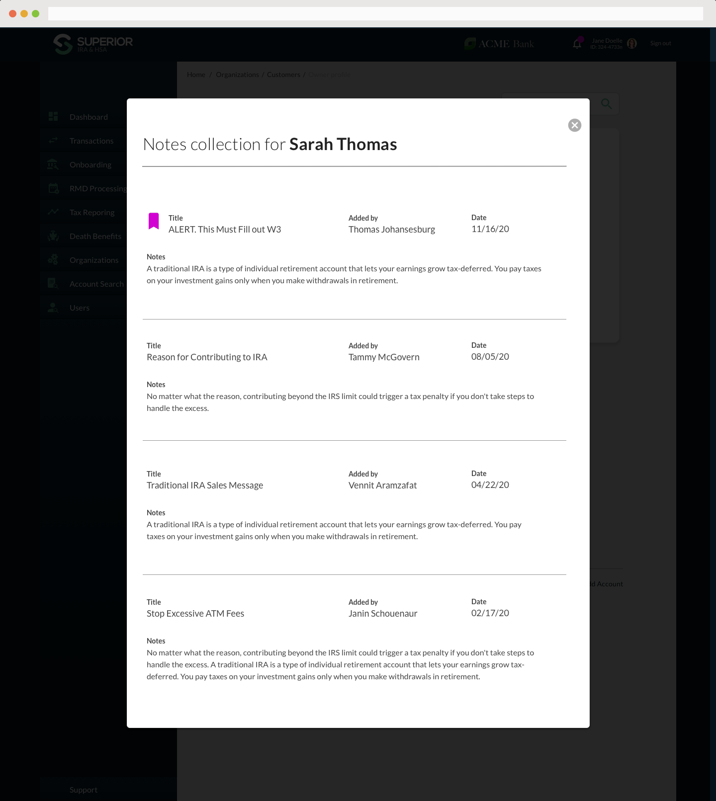
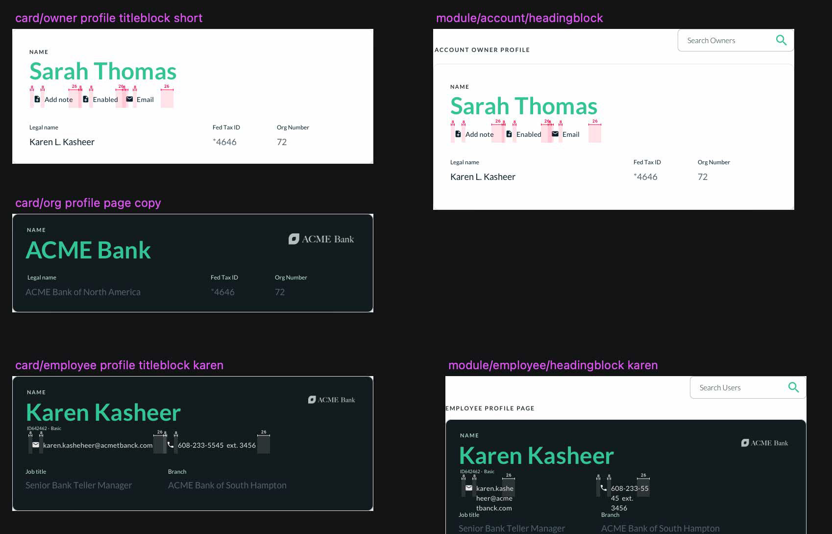
Notes Compiled Regarding Account

Account Owner Profile Page
The Follow-Up
As the first milestone was approaching, the software development team was focused on delivering a working MVP and my time leading the team on the project had come to an end. However, recent reports from the client claim that the design has been highly effective, efficient and flexible in building continuing functionality into the product.
Users also report that the easy-to-follow navigation strategies chosen were successful. User-tests showed that users are able to consistently complete complex transactions with ease. As familiarity with the tool increased users also found that output and productivity increased as well.


